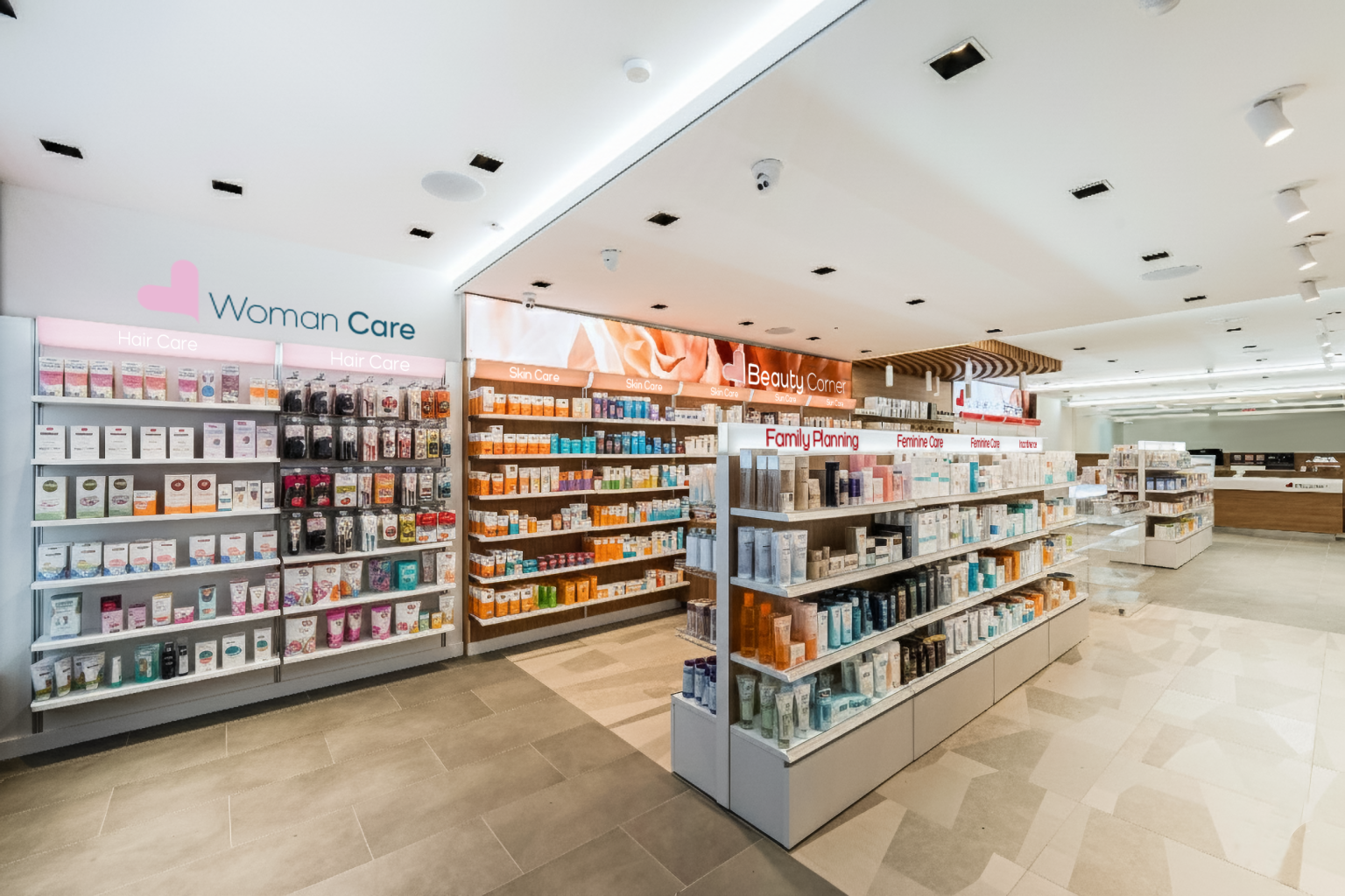
Visual clutter in a pharmacy rarely comes from a deliberate choice. More often, it builds up over time, almost without being noticed.
A display is placed near the entrance to support a seasonal campaign. Another one finds space on the counter. A promotional unit is added to the end of a gondola. These are all useful, immediate tools provided by brands to increase the visibility of products and initiatives.
The problem, therefore, is not the individual display itself, but what happens when different messages, shapes, colors and structures accumulate without an overall strategy.
Each element continues to communicate, but the pharmacy as a whole gradually becomes harder to read.
Visual clutter has a direct impact on business
In a retail environment, space is not simply a container. It is a tool that directs attention, supports decision-making and makes priorities easier to recognize.
When the visual field contains too many competing visual cues, customers have to work harder to understand where to look, how to navigate the space and which products to consider.
The result is not necessarily greater exploration. On the contrary, the amount of attention given to each individual message may decrease.
This has a tangible impact on business. A pharmacy can have a very broad and valuable offering while still failing to communicate it effectively.
A product that is present but difficult to notice takes up space without fully expressing its commercial potential. A promotion surrounded by multiple competing messages loses relevance. A category that is not immediately recognizable requires greater effort from the customer or assistance from pharmacy staff.
Visual order is therefore not merely an aesthetic choice. It contributes directly to the productivity of the space.
What neuromarketing teaches us about attention
Neuromarketing should not be understood as a set of techniques capable of automatically “convincing” customers.
Its most useful contribution lies in helping us understand how people distribute their attention and make decisions within environments filled with visual information.
Our attention is selective. We do not register everything in front of us with the same intensity. Instead, we look for reference points, differences, hierarchies and signals that help us understand a situation quickly.
Research conducted using eye-tracking technologies in a virtual retail environment shows how position, visual characteristics and the organization of visual cues influence what people actually look at and the level of attention generated.
Eye tracking makes it possible to distinguish between what is physically present in the environment and what is actually noticed by the customer. Read the study published in Frontiers in Psychology.
The number of available alternatives also requires attention. The well-known study by Sheena Iyengar and Mark Lepper on so-called “choice overload” suggests that very broad assortments may attract curiosity but do not always make the final decision easier.
The effect depends on the context and does not mean that offering choice is a mistake. Rather, it highlights the importance of organizing choice and making it easier to understand.
In a pharmacy, this principle becomes particularly relevant.
Customers may enter with a specific need, but they may also arrive with doubts, limited time or little knowledge of the differences between products.
The space should therefore help reduce complexity rather than transfer that complexity to the customer.
The problem is not too much communication, but a lack of priorities
Displays and promotional materials can serve an important purpose: introducing a new product, highlighting a campaign, supporting a category or presenting a seasonal offer.
Their effectiveness, however, depends on the context in which they are placed.
If every display uses its own visual language, colors and positioning, attention becomes fragmented.
The result is a competition in which no message truly manages to stand out.
The solution is not to eliminate promotional communication, but to establish a clear hierarchy:
- which campaigns are strategically important at this moment;
- which areas of the pharmacy should receive greater attention;
- which products deserve a focal position;
- how long a display should remain in place;
- which path customers should follow without encountering obstacles;
- which messages can be removed or grouped together.
The pharmacy should remain in control of its own communication.
Materials supplied by brands can be selected and integrated into a display strategy that is consistent with the pharmacy’s business objectives, identity and seasonal calendar.
From individual displays to a merchandising system
The most important step is to stop treating every element as an independent addition.
Product display should work as a system.
Walls, gondolas, counters, windows and promotional points should perform different but coordinated roles.
Wall systems can communicate permanent product categories. Central gondolas can help guide customer movement through the space. Endcaps can highlight high-priority campaigns. The counter can feature a very limited selection of complementary products or products related to the consultation that has just taken place.
Promotional areas, on the other hand, should be clearly recognizable and easy to update.
This prevents temporary campaigns from spreading throughout the pharmacy and continuously disrupting the overall readability of the space.
Sartoretto Verna modular furniture and display systems are designed precisely to organize products, communication and customer flows within a coherent structure.
Modularity makes it possible to change the offering without losing the overall sense of order.
Flexible solutions for more organized promotions
Not every pharmacy needs a complete redesign.
In many cases, improvements can be made by focusing on specific areas and replacing a succession of unrelated promotional displays with coordinated, mobile and reusable elements.
Among the solutions available on the Sartoretto Verna Easy e-commerce, pharmacies can consider:
- GO-PLEXI®, a transparent, reconfigurable gondola that organizes products and communication within a single unit while maintaining visual clarity;
- PALBOX®, designed for seasonal campaigns and promotions requiring a dedicated space that can easily be repositioned;
- PromoCube®, a compact solution for grouping selected products without dispersing them across multiple displays;
- PlexiCube®, useful for organizing products while also helping define customer flows within the pharmacy;
- Price Holders and Category Holders, small accessories that standardize information and reduce the need for improvised signage.
The value of these tools does not simply depend on their materials or design.
Their real advantage lies in the possibility of reusing the same coherent structure across different campaigns.
Products and messages change, while the environment maintains a consistent identity.
The one-in, one-out rule
A simple practice can help prevent visual accumulation: whenever a new promotional message enters the pharmacy, it is worth identifying which previous element should be updated, moved or removed.
It is also useful to establish a clear duration for every initiative.
A promotion without an end date risks becoming a permanent part of the environment, even after it has lost its commercial relevance.
Periodically, the pharmacy can carry out a visual check from three different viewpoints:
- from the entrance, to understand which message is perceived first;
- from the center of the customer journey, to verify whether categories remain easy to recognize;
- from the counter, to assess whether the interaction between pharmacist and customer is being disturbed by an excess of products and communication.
Taking photographs from these three viewpoints can be particularly useful.
A photograph often makes visible what is no longer noticed during everyday operations.
An organized pharmacy does not communicate less
Reducing visual noise does not mean making the pharmacy empty, cold or devoid of commercial opportunities.
It means giving greater strength to what has been deliberately chosen to communicate.
A seasonal product becomes easier to recognize. A promotion gains a clearly defined space. Customers understand the offering more quickly. Pharmacists can provide advice without having to compensate verbally for what the environment fails to communicate.
A well-designed pharmacy connects space, identity and business objectives.
Within Sartoretto Verna’s Pharmacy approach, the layout is designed to improve customer experience, functionality and the ability of the space to generate value.
The Business dimension completes this approach, transforming visual communication into a coherent part of the pharmacy’s overall positioning.
The most effective promotion is not necessarily the one that occupies the greatest amount of space.
It is the one that is recognized at the right moment, within an environment capable of guiding the eye and making choices easier.
When every element has a clear role, the pharmacy does not sacrifice the richness of its offering.
It finally becomes capable of showing it.