Design srategy
Pharmacy Visual Identity
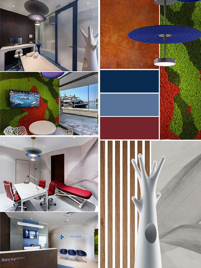
Mood Board
The mood board is where vision and design begin to speak the same language. Through colors, materials, textures, light, and visual references, we define the soul of the pharmacy and establish an aesthetic direction that is consistent with the brand, the context, and the experience we want to create.
Strategic Vision
From the brand to the space, in a single vision
A mood board is not merely an aesthetic suggestion, but the essential bridge between the strategic analysis of the brand and its physical translation into space. At Sartoretto Verna, we use this tool to clarify the style, tone, and atmosphere even before laying the first brick.
This is where we make fundamental decisions about materials, colors, and visual languages, reducing uncertainty and ensuring that every choice supports our business objectives.
It helps ensure a shared vision among the pharmacist, our designers, and the entire team involved. A clear direction allows us to speed up the process and move into the implementation phase with the confidence that the result will not only be beautiful but also strategically successful.
Colors & Emotions
The color palette is never random: it is the first form of nonverbal communication that patients perceive when they enter the pharmacy. We create color schemes that convey trust, a welcoming atmosphere, and medical professionalism, balancing warm and cool tones to set the mood and make it easier to navigate the different sections.
The Psychology of Color
Harmony
Visual Orientation
Materials & Textures
Materials are what give form to an idea. We select surfaces that interact with one another through contrast or affinity: the solidity of wood, the purity of glass, the technical quality of metals, and the softness of fabrics. Each texture adds a layer of sensory depth, making the space not only beautiful to look at, but also pleasant to experience.
Tactility
Durability
Textural Contrasts
Unique Details
Excellence lies in the details that make a project truly unique. From the finishes on the profiles to the handcrafted elements, every detail is designed to enhance the perception of quality. These are not mere embellishments, but distinctive features that transform a generic pharmacy into a place with a strong and memorable identity.
Premium finishes
Distinctive Features
Perceived quality
Metodo sartoretto verna
Perché il moodboard cambia la qualità del progetto
Allinea estetica e posizionamento
Garantiamo che l’immagine della farmacia sia lo specchio fedele della sua strategia commerciale e dei suoi valori.
Riduce indecisioni in fase progettuale
Rende più chiari materiali e palette
Anticipa atmosfera ed esperienza
Permette di visualizzare il ‘carattere’ dello spazio, assicurando che l’accoglienza sia esattamente come desiderata.
Costruisce una farmacia riconoscibile
Evita il rischio di un design standardizzato, creando un luogo unico che si distingue nettamente dalla concorrenza.
Strategic Colors
Palettes That Shape Perception
Natural Colors
Earth tones, light woods, and muted greens to evoke the natural origins of well-being and create an atmosphere of deep relaxation.
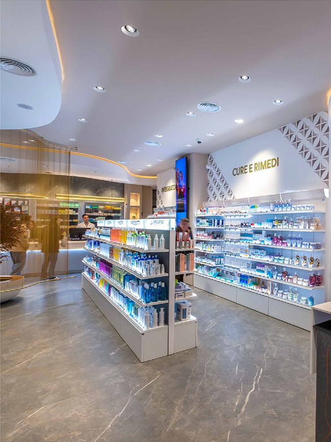
Bright and Clinical Tones
Pure whites, dusty blues, and reflective surfaces to emphasize the hygiene, precision, and scientific authority of the profession.
Premium Accents
Gold, bronze, and matte black for pharmacies that focus on exclusivity, high-end skincare, and an accessible luxury experience.
Graphic Contrasts
Bold combinations of neutral tones and saturated colors create a dynamic, modern look that is strongly geared toward contemporary retail.
Esecuzione
Dal moodboard al progetto reale
Il moodboard è il DNA del progetto. Ogni riferimento visivo selezionato si traduce concretamente in capitolati tecnici, campionature reali e scelte d’arredo. Non è un esercizio di stile fine a se stesso, ma la guida operativa che informa l’architettura degli interni, la progettazione illuminotecnica e la comunicazione visiva.
È la garanzia che l’atmosfera sognata all’inizio sia esattamente quella che il cliente respirerà una volta varcata la soglia della nuova farmacia.
Materiali
Finiture
Arredi
Luce
Visual Communication
Atmosfera
Texture & Material
Material Inspiration
Every material conveys something profound. Surfaces, reflections, opacity, texture, and colors radically influence the customer’s perception of the pharmacy.
The mood board selects elements that make the space professional, welcoming, and distinctive, transforming the pharmacy’s design into a complete sensory experience.


Added Value
What Does the Pharmacist Get?
/01
A clear
direction
There is no ambiguity regarding the aesthetic style to be adopted.
/02
A more consistent
pharmacy
Every element, from the furnishings to the lighting, speaks the same language.
/03
A strong
perceived identity
The brand becomes a physical, tangible, and memorable space.
/04
A shared
database
Confidence in decision-making for the pharmacist and the entire team.
Get started on your project
Create your own moodboard
From vision to reality, we build an identity that takes shape in space. Design tomorrow’s pharmacy today.